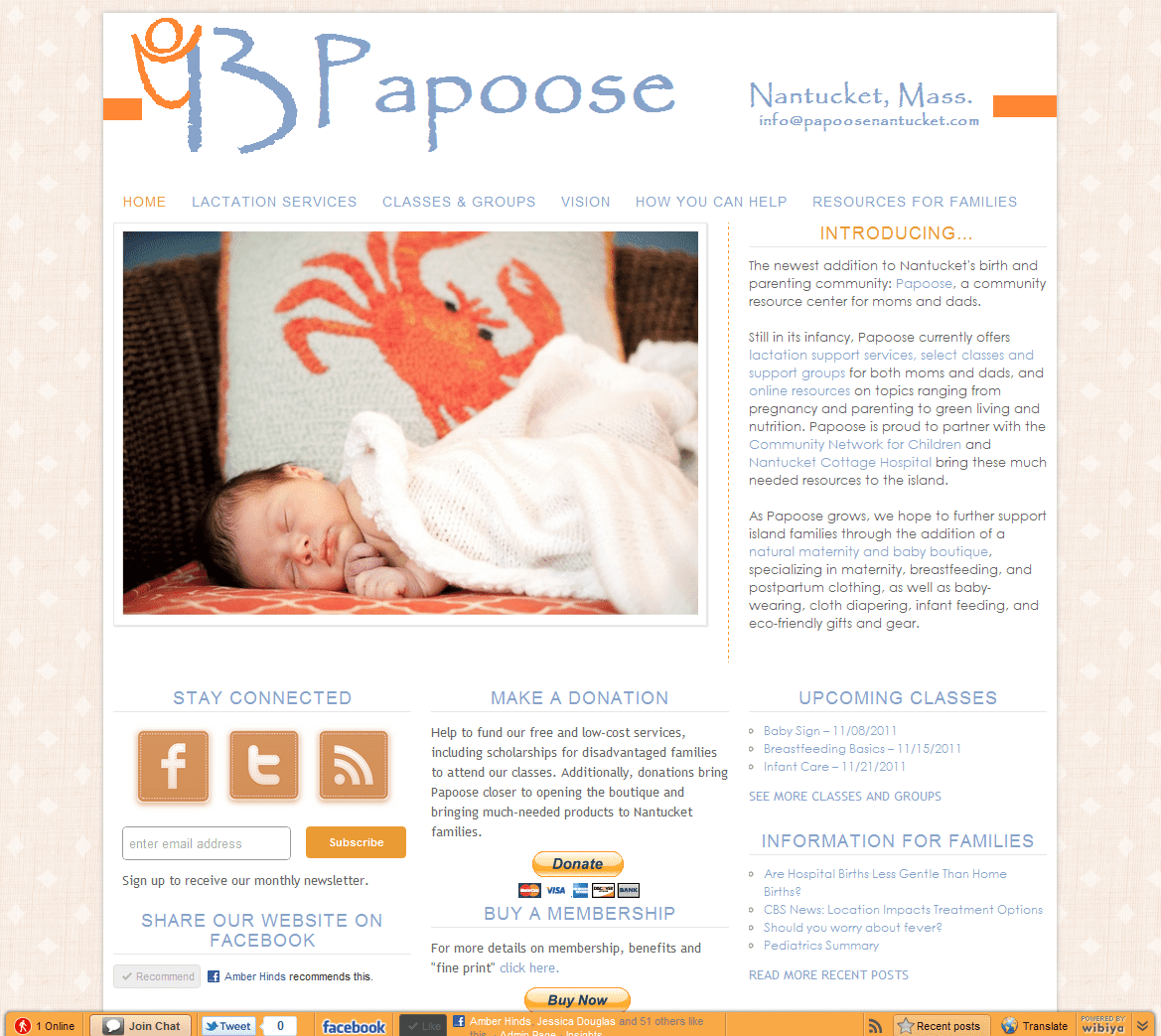
I posted on the Au Coeur Facebook page yesterday that I was working away on a web design project. That might have been an understatement. I might have gotten a little carried away and unable to stop, and in a little over a 24-hour time frame, I took the website for Papoose from plain-jane to this:

I thought I might have been a little sad about the change over, since the original version was the first website I built — a lot of blood, sweat, and tears went into that site. I hand-coded it in Dreamweaver, learning as I went (basically by trial and error). It was a decent site and I was pretty proud of it at the time. But let me tell you, I’ve learned a lot since January, and my websites look eons better. I wasn’t sad to see that website go at all.
Not only does the new site look and work better, it also better represents where I am with the business. Go check it out and come back here to leave me a comment with your thoughts. If you see a bug, glitch, or something that just looks funny, please let me know! You won’t hurt my feelings; I’m assuming there must be one there somewhere since I built the site in…a day. Yes, I’m crazy.
—-
P.S. I almost left you hanging…but realized I couldn’t do it. Raise your hand if you’re interested in brief update on Papoose and I’ll add it in Sunday’s report card. (You can also get a little taste by trolling around Papoose’s website.)
Leave a Reply